Interactive film and UX
Six projects, six interaction modelsThis article is a part of the Battery002 issue: Smart content, shoppable videos and Bandersnatch!
Interactive film and video can be a million things. It could be interactive fiction, documentaries, music videos, games, instructinal videos. All types of videos can be made to benefit of interactivity, if it is done right.
Here is a selection of our favorite interactive film and video projects.
ONLY — The Liberation is not only a music video but a fashion lookbook where you can buy the items in the video. Shoppable video before the term existed!
Cisco — Internet of Everythingis an interactive interview where you can have a two way conversation with the video. Interaction is obviously voice!
Canada Goose — Out There is a cinematic short film where bonus material was integrated in the experience in a seamless way. .
Outcast — The Possession Begins is an interactive trailer for the TV series Outcast. You control the experience with your eyes.
Nissan Infiniti — Deja View is what can be called interactive fiction, pretty much where Bandersnatch would end up. The viewer doesn’t control the film directly. Instead the characters in the film are calling your real life phone, what you say in those conversations affects how the story evolves.
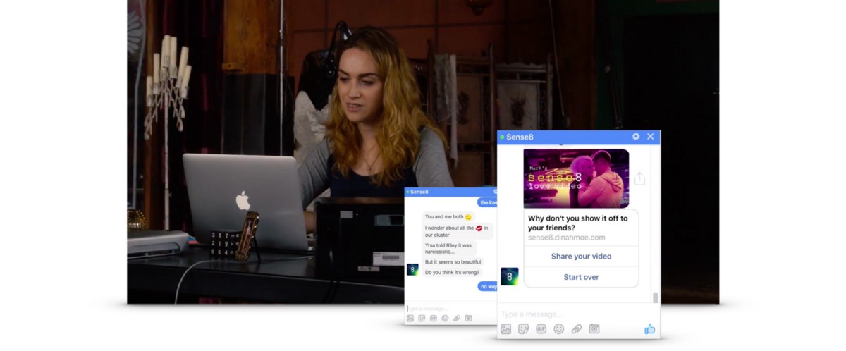
Netflix Sense8 Fanvid Generator allowed fans to create their own fanvideo by chatting with a chatbot impersonating one of the characters in the series. Based on the user interaction during that conversation we rendered a personal, unique video.
I hope these projects will inspire some new creative ideas on how to make a boring static film project into an interactive masterpiece! Here we go!
ONLY — The Liberation
The Liberation is an interactive music video telling the story of the ONLY girls who makes a visit to an unexpecting sleepy town. At four points in the story the user has to interact to make the story move along. The interaction is super simple and at exactly the right level for the viewer’s curiosity to kick in.
All clothes in the video are tracked and clickable which allows the viewer to expore and even buy the clothes. During this time the user move into a kind of frozen universe where you can explore the clothes and accessories that are currently showing.
The music is a specially adapted version of a track by Lune: Let Go. We worked together with Lune’s producer, Carl-Michael Herlöfsson, to adapt it to interactive use. Our mission was to make it work in the interactive experience while still syncing perfectly to the linear parts.
We split up the music in several layers so that we had individual control over them. One layer was the vocals which was split into separate phrases with delay and reverb tails. This way Lune would always finish a phrase even if the user stopped the video in the middle. We created a separate layer for the “frozen world” when the user pauses the video that always plays in sync with the main track. This makes the transition between the worlds totally seamless. For the interactive parts we created music loops that could go on until the user interacts.
When they do, the music waits until the next bar before moving on to the next musical section. There is even a drum fill to bind the sections together as in the linear track.
This and many other small details makes the music totally seamless, almost like a band was playing it in realtime while you watch. The user then forgets the technology and just experience, making this a truly unique interactive film.
The Liberation has been richly awarded: Cannes Lions Gold, 2x Cannes Lions Silver, CLIO Awards Gold (Digital/Sound Design), FWA Site Of The Day & Site Of The Month and more.
Cisco — Internet of Everything
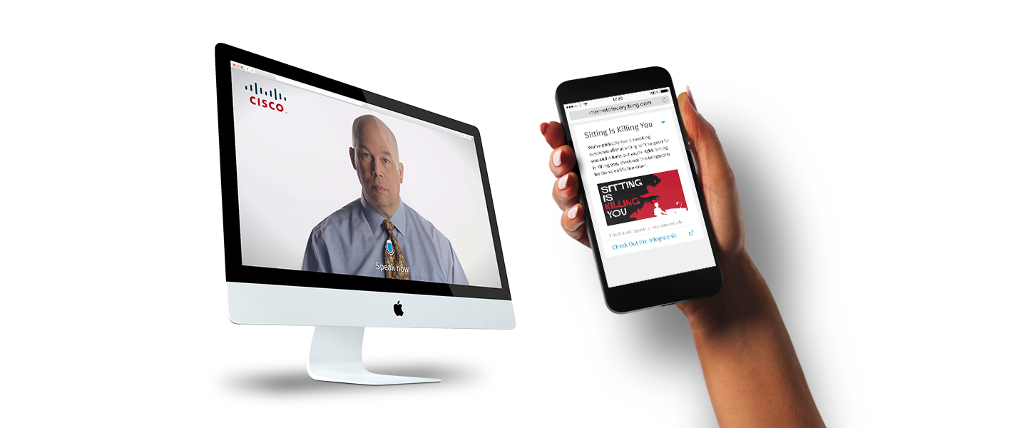
We and GSPSF invited then Google Chief Technology Advocate Michael T Jones to explain the concept Internet of Everything . “Everything” is a pretty big topic to cover in an interview, so we wanted to give the user the possibility to navigate the interview to what interested them most. An interactive interview! Or as Mr Jones puts it, a real two-way conversation.
In this project the whole experience was in the browser, no 4th wall to break, but to present content in a novel and useful way. The user activated their microphone in their browser and could then both navigate the topics and ask questions. Menu options were available for those not using voice.
To enhance the experience we used the user’s mobile phone as a second screen. This content was not only available during the interview but after, as a list of interesting topics to explore deeper.
Using voice made the experience much more personal and human.
Canada Goose — Out There
Out There is a great example of how interactivity can be used to make the experience much richer. It is the first ever global campaign released by luxury outdoor brand Canada Goose. It features the real, incredible stories of the brand’s most inspirational brand ambassadors.
The interactive short film was shot in New Zealand by an impressive veteran film crew. Directed by Academy Award-winning filmmaker of “Crash” and “Million Dollar Baby” Paul Haggis, cinematography by “12 Years a Slave” Sean Bobbitt, music by Oscar-nominated composer Josh Ralph and sound engineering by Oscar-nominated Tom Myers/Skywalker Sound.
The backstory
It is not every day you get the chance to destroy the cinematic art of a two time Academy Award winner with some interactive disruption but that was clearly a possible outcome here.
The film was surely going to be spectacular, no doubt. But it was the idea behind the script that made it truly special. Each of the scenes in the film is based on real events in the life of the brand ambassadors.
They were interviewed about their memories of the specific event, and they told this story and several more in a very personal way. They also allowed access to their private photo albums with previously unpublished images. All ingredients were there to add emotional depth to the scenes in the film.
Normally this kind of material is tagged on in the end but then we would miss the opportunity to give the scenes that extra depth. Instead we wanted to integrate it and connect it to the actual scenes. When the user reaches a scene they should get the option to go down the rabbit hole to hear the real backstory and see the images.
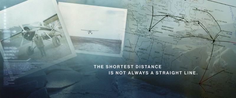
It was essential to not break the movie magic so the integration had to feel like it was a part of the film. The transition must be totally seamless, the music score should continue uninterrupted, the visual transition and the presentation of the personal photos must feel cinematic and in the style of the film.
Here are some early drafts for the photo albums
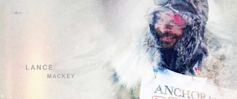
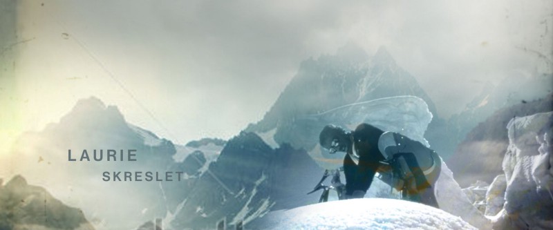
How it turned out
For the user it starts like any normal video. When moving the mouse/touching the screen a timeline appears at the top which allows the user to navigate to any position in the film. The rabbit holes are marked on the timeline so that the user understands there is something special happening there.
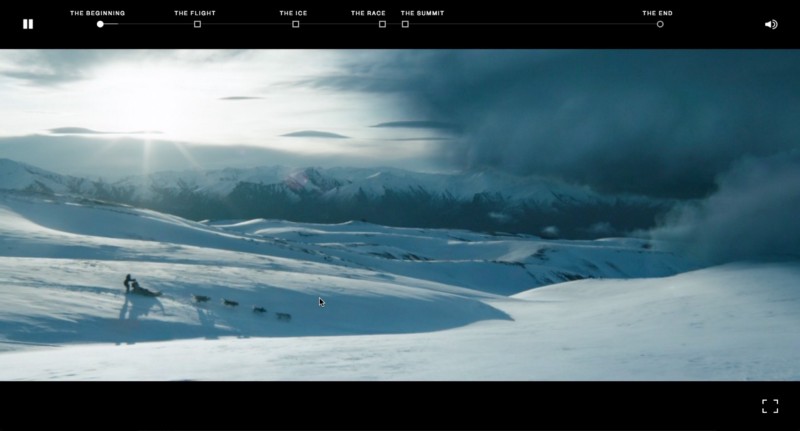
When the user reaches a scene a subtle indicator shows that they can experience the true story behind the scene. By interacting the user is seamlessly taken into a photo contact sheet filled with personal photos describing the scene. The person starts telling their remarkable memories with their own voice, while photos from their personal collections visualises the story. In the site capture below you can hear Marilyn Hofman-Smith tell the story of her close encounter with death.
There are two additional memories that the person shares. The contact sheet is interactive so the user can explore it and find additional photos by moving it around. When the user is done they are transported back to the film at the same position where they left off.
It doesn’t feel like the main film is interrupted, it feels like the story is enhanced. From this point the user looks at all the fictional scenes with totally new eyes, knowing that there is a real story behind the scene.
Outcast — The Possession Begins
This is an interactive trailer for the TV horror show Outcast that we produced for our client Campfire. The series is created by Walking Dead Robert Kirkman and is all about demons and possession, kids chewing off their own fingers and worse, great fun!
The experience allows you how it feels to get possesed. When you close your eyes you allow the demon to possess you, when you open your eyes you realize that the possession is all around you, there is no escape. It is all about immersion, to bring the user into a narrative and lose themselves. It is hard to find an example more suitable of an experience that responds to you!
Some backstory
Budget and time did not allow to even think about developing a custom solution for detecting opened and closed eyes, so we looked at which existing solution would produce the most reliable result. Visage was by far the best at the time. However, the library was huuuuge (13MB) so using it on mobile devices felt like a bad idea. This was not a showstopper since mobile is used in situations where closing your eyes might seem suspicious to people around you.
While keeping your eyes closed you could hear a demon walking around you (3D binaural sound, headphones highly recommended). The visuals weren’t that important (eyes closed, duh!), we made a simple video loop with the black goo that is so persistent in the series.
The demon script was a linear story which you followed to the end, even if you did not want to. You could try to your eyes to stop it but the moment you close them you were back exactly were you tried to escape.
For the open eyes world we needed to create visual material which required access to original material from the series. This turned out to be a challenge. The fear for leaks before launch of the series was palpable (the general paranoia for leaks has gotten far worse since then 😓). We were required to work on a computer not connected to the Internet, not a simple thing interactive production.
It was solved through a combination of physical security and that we only got access to one second long clips that did not reveal ANYTHING about the plot. In Swedish we have an expression which translates to “cook a soup on a nail” which describes the situation perfectly. The soup actually ended up quite tasty in the end.
Depending on where you opened your eyes in the demon storyline you were served clips that were connected to what the demon was talking about. The clip ended in a loop (seamless of course) until you closed your eyes again.
The interactive soundtrack was a very important part in making the experience immersive and as intense as it was. I will cover the importance of sound in interactive applications in a future article.
From a technical POV
The experience was made to have the widest technical support possible. It supports desktop, tablet, mobile, and can be controlled by eye tracking, keyboard control, touch. The full experience is supported on all major browsers including Internet Explorer. iPhone before iOS10 doesn’t support interactive film since it opens video in its own player, but thanks to a hack found by our friends at Earth People we were able to support that too.
And how did it turn out?
Pretty good I think. It won three Clios, a gold for Technique, a silver for Innovation and a GRAND in Digital, and a Bronze Lion in Cannes for User Experience Design. It is not an Oscar but close enough (genetically Lions and Oscars are 99% the same, I don’t know about Clios though).
Nissan Infiniti — Deja View
Deja View is a great example of choose-your-own-adventure. Itis an interactive film where you interact with the characters in the film by talking to them. During the experience the characters will pick up their phones and call your real world phone. What you say to them determines what will happen next and how the story evolves.
The backstory
When I read the brief from our client Campfire for Deja View it was immediately clear that this was something out of the ordinary. It described an interactive film experience where the characters in the film calls you on your mobile phone and you have a conversation with them. It had to respond immediately to user interaction. The goal was to create a motion pticture quality experience. At the time I did not know the scope of the script but in every aspect it felt huge, lots of scenes, alternative takes, clips.
Super cool but could it be done? Or rather, could it be done with the quality and user experience that the idea deserved? I jumped into the deep end to define the project components. A custom phone system, speech recognition, natural language processing, dialogue flows, the list goes on. And the icing on the cake: realtime edited interactive video with a level of control never done before. It was a fantastic challenge!
The producer expected a Flash solution but I did not want to do that. For me it was already dead as a technology (this was 2013, ancient times). I also wanted the experience to run on iOS and Android. This was not a requirement from the client, but the mobile trend was clear to me and it felt like a good investment for the future.
The traditional method of preloading clips would not be feasible. At all decision points there would be several clips to preload since all had to be ready for playback. The logic for this would become very complex and brittle. Adding tablet support and it was clear that this was not the way to go.
Without gettting too technical we developed a method tthat allowed us to use a single video element and that supported the unique complexity of the project.
But that was only one of many challenges. The one that took the longest to find the optimal solution for was the phone system, the speech recognition and natural language processing. It was not until a couple of days before the deadline for the proposal that we knew we had a solution that could deliver with quality. One day that story might get its own article.
How does it work?
The user calls a number and gets a code, enters this in the browser and the experience starts. The first scene show the two main characters sitting in a car, waking up with no memory about who they are or where they come from. Looking at their mobile phones they discover that someone has called them several times, the number on the screen is YOUR phone number. The man decides to call you and your mobile rings in real life. Here is a screen capture:
The characters calls you at several points in the story to ask you for help to solve the mystery. During the calls you don’t see the actors (alhtough that would have been possible too), what you say during the calls affects how the story evolves.
In the screen capture above the user mentioned “dry cleaner” (makes sense if you have done the experience 🙂). After the call we weave what the user said into the conversation by playing a corresponding clip.
The video is very responsive allowing us to change a single sentence as above whithout any latency, buffering and loading. In several other decision points there are up to four alternative clips, sometimes within a second from the user interaction, which are played back as if it was edited that way.
There was over 35 minutes of video and a total of over 300 clips that were controlled interactively. Below is a simplified flowchart for the video part.
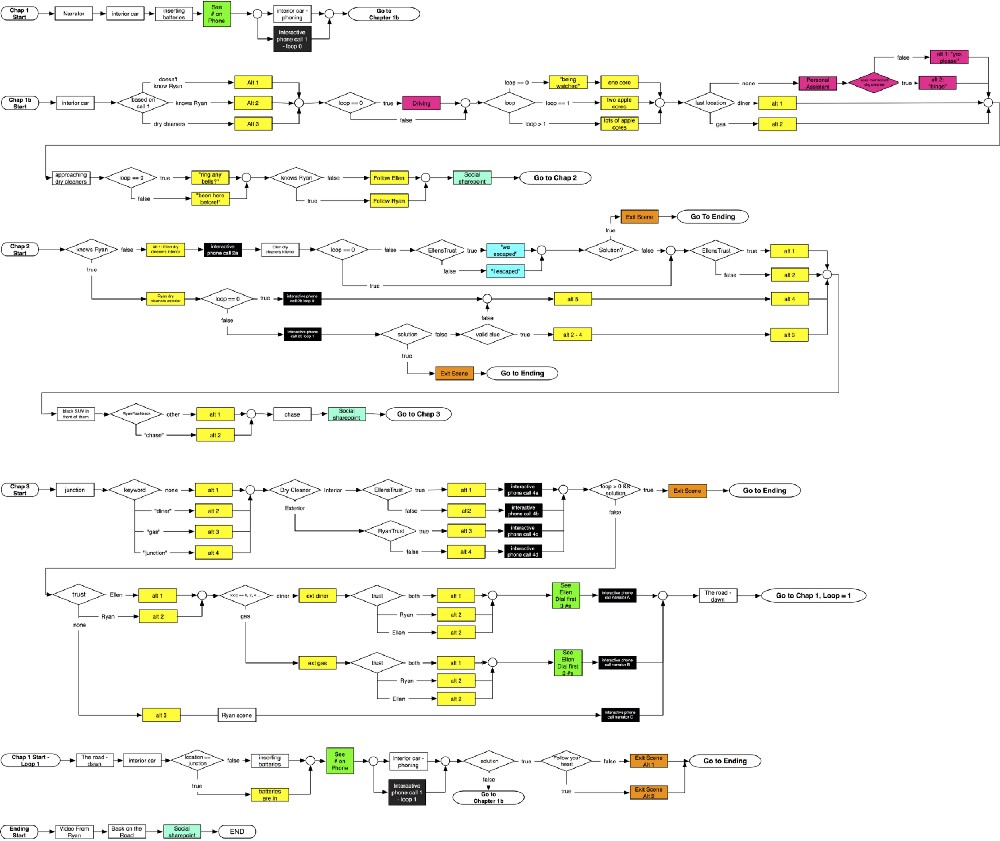
The flowchart does not include flows for the interactive audio track. To cover all these edit points the audio could not be on the video itself since that would cause ugly cuts in the audio. Creating an interactive sound track is an essential part of making the experience feel like motion picture quality. I will cover this part in a separate article.
The flow charts for the interactive phone calls are also not there, each of them similar to the one for video, a potential topic for another article (so much to write!).
Netflix Sense8
Sense8 is a Netflix series about 8 people that are emotionally connected in a supernatural way. The fan culture for the series was very strong and users produced fanvideos with their favorite characters from the series. Campfire approached us with the idea to enable users to create fan videos without having to know anything about video editing.
The solution was a chatbot driven experience where users communicated with one of the main characters from the series, Nomi Marks. During the conversation we detected what characters in the series that the user liked and what emotional content they preferred. Based on this we rendered a personalized video that the user could share on social media.
Behind the scenes
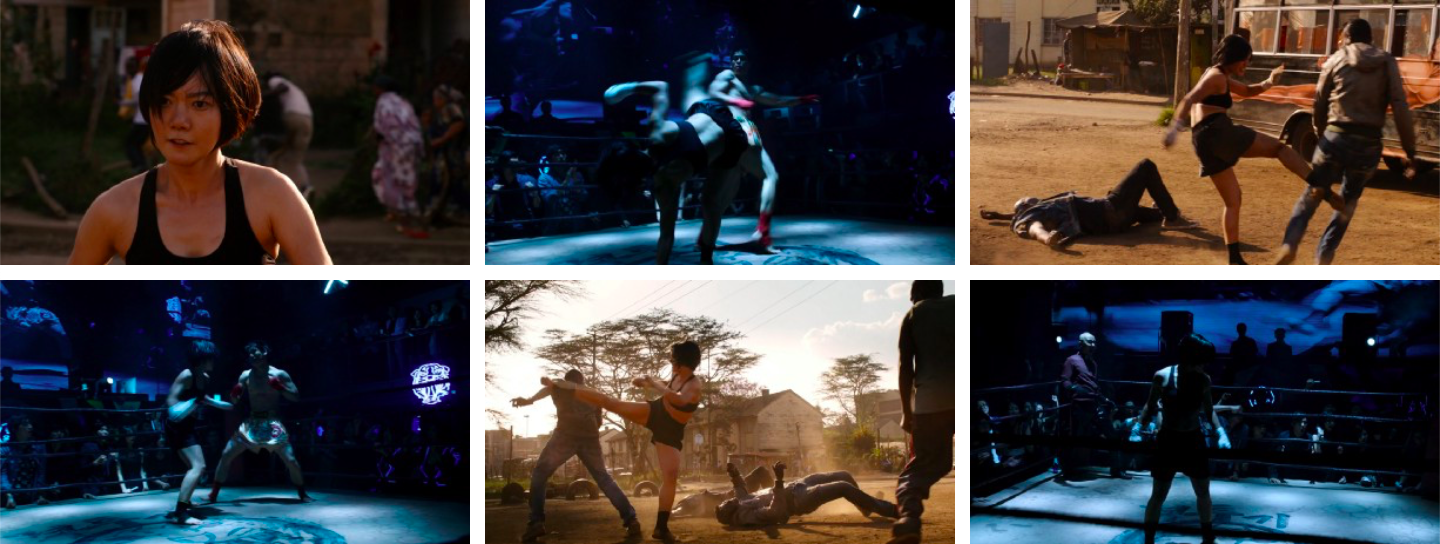
We already knew how the fans wanted a fanvid to look like since there already was a ton of them on YouTube. The raw video material was 15 hours from season one and a bonus Christmas episode. The first challenge was: how condense all this material down to basic building blocks that can be combined into an infinite number of fanvids that really feel personal.
We started with editing the raw material into separate clips. We did not use the audio from the clips since we wanted to add a super emotional music score on the final video. This excluded all clips where you could see the characters talking.
The first tests assembling the clips into videos showed that using separate clips was the wrong approach, we lost all story telling and the final video just felt random.
We needed to keep related clips together to make sense so we experimented in combining the individual clips from a specific scene into one or more mini stories. The editing had to be like a movie trailer so every single clips was cut down to its minimum. Except the love scenes which does not work well in action editing style.
We were now down to around 1000 mini stories, 1,054 to be exact. The length for the final video should be between 35 and 45 seconds. Each final video would then be a combination of around 5 mini stories, each between 5 and 8 seconds long. This would create enough number of combinations to blow my tiny math brain.
All mini stories were categorized for character and feeling in a custom CMS that allowed easy testing and rendering of videos. New tests started to look good but still felt a little random.
We added a logic layer to handle the obvious story telling errors:
- some clips had to be in order, e.g. a house that is blown up cannot resurrect in the next clip.
- some were different versions of the same mini story and should not be in the same video,
- some only worked as the last clip etc.
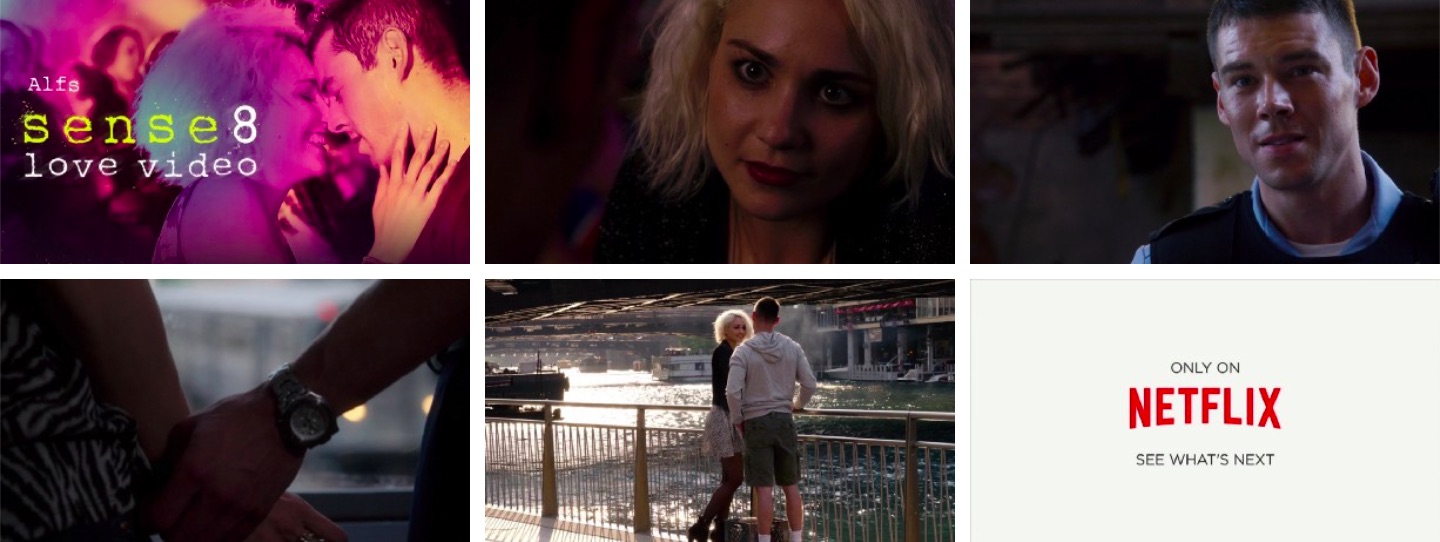
Now we had all pieces in place. The server application rendered a title card with the user’s name, combined a selection of clips based on the user’s preferences and the clip logic, added a custom music score, rendered the final video in less than 2 seconds, returned it to the user so they could share it in their social channels.
The final result has made people cry, literally. I am not kidding.
During the first week with a completion rate of 90% over 8,000 users went through the 3 minute long chatbot conversation, got their personal video and shared it in their social channels.
Two approaches: in-browser or server side
There are two approaches to generate dynamic personalized video. Either the personalization is done in the browser or it is rendered on the server side and then delivered. Both methods have its pros and cons so which to choose depends on the project. Below are the main differences:
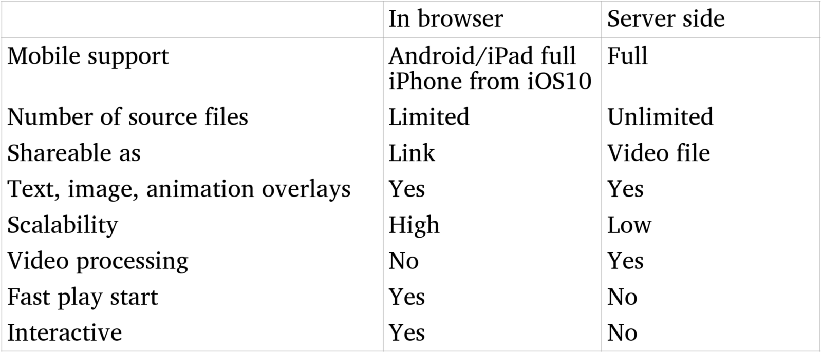
In the case of Sense8 we used server side rendering of two reasons:
- the high number of mini stories
- we wanted the user to be able to share a native video, not just a link
These are the two most common reasons for any project to use server side rendering. The main benefits to do the personalization in the browser are
- scalability. In-browser uses CDN for assets and can be scaled to any number of simultaneous users. Server-side rendering requires dedicated hardware that has to be scaled linearly with the number of users.
- immediate playback, server side rendering takes time for the rendering which makes it unsuitable for realtime delivery.
- interactivity, e.g. added functionality, user selections. Dynamic personalzed video in the brwoser can be combined with any of the functions described in the article about interactive video.
Conclusion
This was just a selection, and only a brief introduction to where interactivity makes sense. As I said in the introduction fiction, documentaries, music videos, games, instructinal videos, all can be made to benefit of interactivity if it is done right. Eventually many of what today is static videos will become interactive.
This article is a part of the Battery002 issue: Smart content, shoppable videos and Bandersnatch!


