Interactive film under the hood: the Art of Seamlessness
Caring for the details pays offThis article is a part of the Battery002 issue: Smart content, shoppable videos and Bandersnatch!
It has always been our highest priority to create experiences where the technology doesn’t get in the way. Every obstacle and disturbance breaks the magic. You are thrown out of experiencing mode and into observing mode, or in worst case complaining mode.
The obvious examples are loaders, bad UX, glitches, bugs, but here I will write about what breaks the experience in the medium itself.
The goal is to create what I call a seamless experience. The viewer should not even notice or think about the smoothness, they should just be totally absorbed by experiencing.
If awards are anything to judge from it seems like caring for the details pays off pretty well. The three productions below have collected a total of
- 4 Cannes Lions: 1 gold, 2 silver and 1 bronze
- 4 Clios: 1 GRAND, 2 gold and 1 silver
- FWAs Site Of The Month, Site Of The Days
- and more
So cheers for craftsmanship, here is a selection of our contribution in the seamless category. If this article is too specialized for your taste and you just want one takeaway, just remember the awards 😜.
Our forgiving eyes
The mind has an amazing ability to accept the weirdest cuts in film.Jumps in positions, angles, time, space and we’re just “ok that makes sense”. Cuts is actually how we tell stories visually. Even visual errors are passing the quality test, freeze frames are fine as long as they are not too long and frequent.
Sound on the other hand immediately is noticed as an error. A single drop out in the audio and everyone, not only the media pro, noticed that something was wrong. We expect sound to be continuous, and we immediately notice when it is not.
We are even more sensitive to music, jump out of sync and the whole dance floor gets off balance. For a music professional we are talking single digit milliseconds.
Seamlessness in a nutshell
If you jump on the timeline on a YouTube video you don’t expect a continuous experience, quite the opposite actually, but in interactive film creating a cut that you notice is never a positive thing. At best it just feels a little sloppy, at worst it breaks the experience. So it makes perfect sense to put some work into avoiding interruptions of all kinds.
There is another side of the coin though. Sound can actually be used to bind interactive film together, smoothing out the glitches and allowing the viewer to experience the film uninterrupted.
Below are three different projects that showcases how we use the sound track to create a seamless experience. If you are not familiar with the projects, please have a read here since I will skip the general presentation and instead jump start with a screen capture and then breaking it down from there.
Please note, you really have to look at the screen captures to get the whole story, so don’t be lazy and try skimming!
Outcast — Possession Begins
In Possession Begins we are moving between our inner world where a demon wants to possess us, and the outer world where we can see how possession is all over the place. As you can notice the transitions between the two worlds are totally seamless.
The inner world
Starting with the inner world, i.e. having your eyes closed. Visually we show a short video loop of black goo. iOS doesn’t support multiple video elements playing at the same time, so a video loop would not allow a seamless transition between the two worlds. To solve this we did the loop as an image sprite instead.
The black goo does not have any sound in itself, instead we are in the world of the demon. The sound track is binaural to make you feel that you are in the middle of it all. The inner world is a linear story that you cannot skip or jump around in. You can try to escape by opening your eyes, but when you close them again you are back at the same place you left, no escape.
We separated the sync sounds from the demon voice. The timing of the demon phrases was time locked to the sync sound, so if you would run the experience from start to end with your eyes closed the separation would not have made any difference.
It is in the transitions between the two worlds that it matters. We could now let the demon complete his current phrase uninterrupted instead of doing a fade out. There are several benefits to this:
- it makes the experience feel more seamless and crafted.
- we know that the user got the whole story
- the demon becomes more real, he is not just faded away like some silly audio file, he doesn’t repeat himself when returning as if he was just on pause.
Here is a simplified timeline to ponder:

The outer world
Over to the outside world. When you open your eyes we make a visual transition to a nightmarish scene showing someone “enjoying” the company of the demon. The scene is selected based on what the demon just talked about so depending on when you open your eyes you will get a different scene.
There are ten different scenes, all using the same form: a buildup that lands in a video loop that runs until the viewer closes their eyes again.
The sound for the buildup and for the loop were controlled separately. Adding the sounds to the video clips would not have been possible since this would produce disturbing cuts in the audio.
ONLY — The Liberation
The Liberation is an interactive music video for the clothing brand ONLY. There are four different positions where the viewer has to interact to make the story move along. All clothes in the video are tracked and clickable which allows the viewer to expore and even buy the clothes. During this time the music video is paused.
This is one of my favorite projects. The interaction is super simple and at exactly the right level for the viewer’s curiosity to kick in. It is shoppable video before the term existed. The story, casting and direction is great!
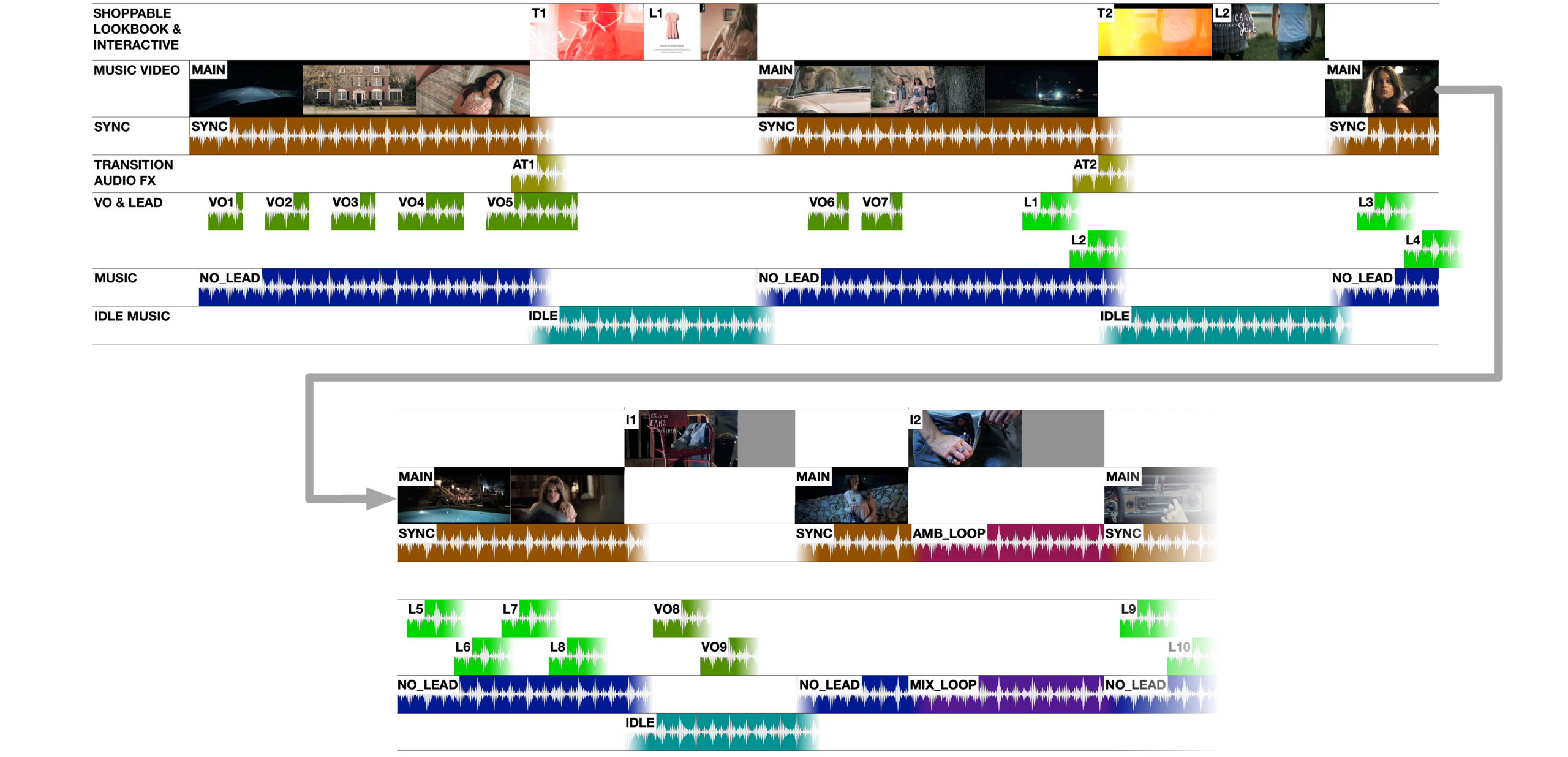
It is also a perfect project to show the importance of seamlessness and a fun challenge to solve. Here is a simplified timeline of a part of the video:

Since the video is paused when exploring the clothes we could not have any sound on the video itself. We wanted the sound to fade out after the video was already paused, otherwise there would be an ugly cut in the audio. Therefore all sounds were played and controlled separately.
Starting with the sync sound. The sound design is not too busy since the music is the hero, but there are sync sounds all through the experience. There are sections in the film where the music is played in loop, during those there is instead an ambence loop playing.
The music itself was mixed without lead vocals. Each phrase of voice over and vocals where separate files and played in sync with the music track. This way we could let the current phrase play uninterrupted to the end even if the user paused in the middle of it. Seamlessness! The lead vocal phrases where bounced with delay and reverb to make them end in an uninterrupted way, as if the vocalist wanted to make a pause.
When the user pauses the video the music mix is replaced by a pad playing the same section and in perfect sync with the mix, once again allowing for a seamless transition. We also play a transition sound designed for the visual transition effect that makes the transition even more seamless.
At some points in the video the music track loops until the viewer has completed a task, e.g. at 2:04 in the screen capture above. When the viewer is done with the interaction we wait for the next bar, play a little drum fill and move to the next musical section, all in perfect sync.
Nissan Infiniti — Deja View
Deja View is a more “traditional” interactive film. However, there was nothing “traditional” with the size and scope of the project: over 35 minutes of mastered film, 300 video clips, 200 audio clips, a custom built phone system, speech control, NLP, fake AI etc.
From an interaction standpoint it is also special because of the way the user controls the experience. There is no direct interaction with the film, instead the story is changed by what the user says in the phone conversations.
That did not reduce the requirements of responsiveness. At one point the last words in a conversation on the phone affected which one of six available clips that should immediately play. Seamlessly.
The technical solution we developed allowed for this complexity in a highly effective and responsive way. I have described this more in detail here.
But this is about seamlessness! So let’s have a look at the timeline:

One of the benefits with our technical solution is that it allows very responsive and precise control over even very short video clips. At 1:27 in the screen capture one character mentions a dry cleaners. It is one of five alternative clips that could be played at that position, you can see the clip in the chart as a dynamic edit. We use this responsiveness all through the experience.
This level of fine grained control over the video clips makes seamlessness in the sound track more of a challenge. We used the sound track on the video file itself for dialog and spot sounds that would not be interrupted by the dynamic selection of clips.
In some cases this was not feasible, e.g. dialog or spot sounds that overlaps an edit point between two dynamically edited clips. In those cases we made the sounds separate and triggered them in sync with the video.
The ambiences were separate sounds controlled dynamically depending on clip. This way the ambience helps to bind clips together that are selected dynamically, making sure that all dynamic clip transitions are seamless. The music score also had the same function, to bind dynamically selected clips together, covering all the eidt points that otherwise had become obvious.
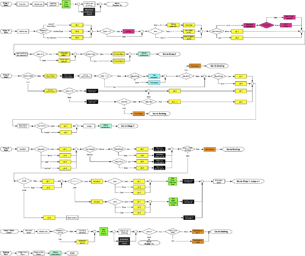
That was about it! And if you think this wasn’t too impressive, let me remind you of the video flow chart:

And then the flow charts for the interactive phone calls on top of that, but I think there are enough timelines and charts for a day.
To summarize
To make productions seamless is all about the user experience. It reduces friction, removes obstacles and creates a premium feeling. It pays off to care about the details!
This article is a part of the Battery002 issue: Smart content, shoppable videos and Bandersnatch!


